Exporting DAZ Studio 4 figures to Blender

Information on this is a bit scattered, so here are my findings.

There are two reliable ways to export Daz figures to Blender (and other programs).  One is to export the mesh as a wavefront object (*.obj), the other is to export as a COLLADA file (*.dae).

After experimenting with both, I found that exporting as a collada file was quicker and more reliable because:

  • Textures  are automatically mapped and assigned to materials correctly
  • The model is automatically rigged to an armature (skeleton) which means you can animate and pose it in Blender.
  • I encountered geometry errors using obj.

On the downside:

  • Daz Studio operates in Y-up whereas Blender works in Z-up, everything has to be rotated on the X axis by 90 degrees.  This adds an unnecessary layer of complication to your workflow.
  • The figure’s pose / animation is lost in the process.

Fortunately you can restore this by exporting the pose separately as a BVH mocap file.  It’s a bit of a hassle to correct the rigging, but if you prefer to pose your figure in Daz Studio (or Poser), or have hundreds of stock poser poses saved over the years, this is the way to go.

Workflow

In Daz Studio:

  • Hide everything in your scene except the model you want to export.
  • Export the scene as *.dae using custom options (without daz enhancements), and tick all of the settings.  Be sure to combine the alpha and diffuse maps into a png file (more on this later).
  • Now export the scene as a bvh file, using the default settings.

In your operating system, navigate to the directory where you exported the files.  You should see a *.dae file, a *.bvh, and a folder which contains the model’s textures.  Move the *.dae file into the newly created folder with your exported textures, open it in notepad and then search for references of “./filename/” and delete them.  (where filename is the name of the *.dae file;  e.g. “./filename/texture.jpg” becomes simply “texture.jpg”)

For more help on exporting, please read this excellent article.

In Blender:

  • Open Blender and import your bvh as an armature.
  • If you select the armature and go to edit mode, you’ll see that some of the child bones (fingers, eyeballs, toes, etc) will not have imported correctly.   Either delete or fix these bones (I would just delete them).
  • Import your *.dae file

Now you have your model with it’s own armature (in a t-pose), and a standalone armature imported as bvh with the pose or animation you want to use. The final process is to use the constrain bone tool to link the two armatures together.  I know it’s not the most elegant solution, and if you know of a better way, by all means let me know. :)

So, under your model’s armature pose node, go through every major bone, and add Copy Rotation and Copy Location constraints.  These should link to the bvh armature’s pose as the target.  This process is fairly tedious and the biggest drawback of using a collada file; however were you to export as an obj, you would now be messing about trying to reassign materials and figure out how to fix or hide geometry errors.

Finally, you might find that some bones (hip, abs, chest) appear twisted out of recognition.  On the rotation option, choose ‘offset’, and then rotate the bone 90 degrees on the X axis to correct the error.  Offset basically combines the values of the source bone with the target bone, which simply means you can make corrections without losing the original pose.

Hair and alpha maps

Daz models use alphas for details like hair and eyelashes.  Alpha maps in Blender are something of a headache for new users like myself, so here’s a quick note on them.

When exporting from Daz, it’s important to select the option that combines the alpha map with the diffuse map – this will give you a png file, with automatic transparency, which is a lot easier to work with in Blender.  One thing to bear in mind though is that if the material doesn’t have a diffuse map (e.g. eyelashes), it won’t create the png, so in this case it might be best to set the alpha map on both the opacity (alpha) channel and the diffuse one before exporting your model.  In fact, this might be the best practise anyway, as you can then set the material’s colour using a shader, rather than a diffuse texture.

With your model and materials loaded, you need to quickly adjust the material and texture settings to enable the alpha to work correctly.  To do so:

  • Enable transparency (Z-transparency) on your material.
  • On the material’s texture, under image, enable premultiply
  • Under influence, enable alpha and set it to -1.0, set Dvar to 0.

That’s it — apparently ‘use alpha’ under image sampling is not necessary.  You might also consider turning ‘traceable’ off, under material options, to reduce render times.  For simplicity, I also recommend exporting hair style objects/figures as a separate *.dae file; that way you can use them for other models.  You can then fit them to your model using the Copy Rotation and Location bone constraints as before.

Thanks for reading, I hope this helps a bit.

Further reading:

Exporting from Daz to Blender 2.5: http://www.4colorgrafix.net/2011/06/dazstudio-blender2-5/

Exporting bvh files:  http://www.ipisoft.com/en/wiki/index.php?title=Animation_export_and_motion_transfer#COLLADA

Alpha maps in Blender: http://wiki.blender.org/index.php/Doc:2.4/Tutorials/Textures/Use_Alpha_for_Object_Transparency

Gamma Correction and Linear Colour Space

I stumbled on this by accident, looking up some articles on digital lighting and rendering:

  • Everything you ever used to do was WRONG
  • Everything you ever got out of your renderer before was WRONG
  • Everything you’ve ever put into it was WRONG

(From: http://mymentalray.com/wiki/index.php/Linear_color_space)

Pretty blunt, eh?  It got me interested in finding out more about gamma correction and linear colour space,  but unfortunately the majority of articles assume a fairly advanced level of understanding 3d graphics software and rendering programs.   So what follows is a simplified, condensed summary of the topic, as I understand it.  My aim is to try and present this in a form that’s clear and practical enough for intermediate/hobbyist artists, like myself, to understand and use.  It’s taken me a while to get my head around this, so bear with me.

The basic idea is this:

  • 3d rendering software renders at a different gamma setting (1: linear colour space) to what your monitor is set at (2.2 on pc, 1.8 on mac).  This is correct — it’s supposed to do this to get the light calculations right.  But what it means is that you have to manually apply gamma correction to your rendered image afterwards (either in Photoshop, or by the rendering software itself).
  • Unfortunately, a lot of people aren’t aware that their output render needs to be gamma corrected (and traditionally, the default settings don’t enable it), so instead, when they render their work, they compensate by adding more lights, and other shader “tricks”.  While this is OK for most people; technically speaking, the renders are physically inaccurate (i.e. WRONG), and you’re not making the most of the renderer.  You’ll will also see more visible problems when you use more advanced lighting, such as fall off.
  • Furthermore, the majority of the textures you put into your renderer have already been gamma corrected beforehand (in photoshop).  So what happens when you apply gamma correction to your image at the end is that it gets applied twice (before rendering, and then afterwards) — making the image look washed out.  Since you only want gamma correction to be applied at the end of your rendering pipeline, it’s necessary to gamma un-correct all of your texture maps, materials, and shaders before the renderer works with them.

So in a nutshell, what you need your software to do is:

1.  Input Gamma: Automatically apply gamma un-correction to your texture maps, shaders and materials beforehand, by an inverse gamma of 2.2.  (i.e. 1/2.2  = 0.4545454…)

2. Output Gamma: Automatically apply gamma correction to your rendered output, thus bringing your image to the correct colour space as your monitor (2.2. or 1.8.).

The settings will vary from program to program, but at the very least you should expect to see input and output gamma settings.

If your rendering software doesn’t have any options for Gamma correction (e.g. Daz Studio 2.x), then you can still work in linear colour space, but it’s a heck of a lot harder to set up and more difficult to tell if you’re doing it correctly.

1. Input Gamma: You have to un-gamma correct everything by hand (i.e. in Photoshop).  And I mean everything — textures, shaders, colours — the works.  You can use an inverse gamma curve to do this, or by adjusting the input levels midpoint by 0.455 (image-> adjustments->levels…).

2. Output Gamma: Simply apply 2.2 gamma correction inside Photoshop (or equivalent), and hope for the best.

The problem with this method is in how accurate your gamma correction is.  I’m still using regular Photoshop CS, and there are no explicit gamma controls.  Even worse, changing the gamma via levels gives me a slightly different results to using curves, making reliability an issue.

If that was a load –  don’t worry.  :)  It’s taken me the better part of a year to get my head around it, and in spite of that, I’m still not crystal clear on some parts.

However, I will end this by saying that understanding linear colour space and gamma is worth the effort.  It might not instantly transform your images into works of art, but the lighting will at least look natural — even if your characters don’t.

____

Update:

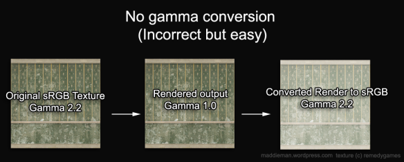
I’ve discovered a more consistent and reliable way of correcting the gamma in Photoshop, using colour profiles.  Essentially what you do is make a linear colour space profile with a gamma of 1.0, and then you assign this profile to your textures before working on them.  When you finish, you convert your render to sRGB or AdobeRGB and it does the gamma correction automatically.  As this was requested in the comments, I’ll walk you through an example:

Creating a linear space colour profile

So, you have your basic jpg texture map in sRGB like so:

This one is from Max Payne, by Remedy.

The first  thing you want to do is turn Proof Colours on, and edit Proof Setup to Monitor RGB (or win/mac rbg if you prefer).  You shouldn’t see any visual difference, and that’s intentional.  However, it’s worth getting into the habit of checking proof colours because when you start working with linear colour space in Photoshop, you’re going to need to turn proof colours on and off to see what it looks like.  I also recommend at this point that you convert the image from 8bit per channel to 16 bit (so we don’t lose any colour information during the conversion), in the Image->Mode settings.

So essentially, all we want to do is create a colour profile with a gamma of 1.  We do this by choosing Image -> Mode -> Convert to Profile…

Under the heading “Destination Space, Profile:” choose Custom RBG… ; this will bring up another window that lets you set your colour profile.  Simply change Gamma to 1.0, and rename it to something like “Linear Colour Space”.  Leave the other settings to default.  Under Engine, I left it as ACE, and under ‘Intent’ I changed it to Relative Colorimetric.  Hit ok, and…

Nothing happens.

Set your proof colours to Monitor again and… now your texture map looks darker.  That’s the image correctly converted to linear colour space (gamma un-corrected).  If you’ve been paying attention to the histogram, you should also notice that it has shifted to the left.

Now, if you save the image as a png or tif, your renderer of choice should correctly import the texture in linear space.

The final step is to create a custom colour profile so you can quickly convert other texture maps to linear.

You can do this under Edit -> Colour Settings…

Under Working RGB, if there isn’t already a linear RGB profile, simply choose ‘custom RBG’ again, and set gamma to 1.0.  Then save your profile and give it a good description.

Working in linear

With your linear colour profile created, you need to start thinking terms of linear (gamma 1.0) and sRGB (gamma 2.2) space.  Assuming your rendering software doesn’t support colour correction (modern ones like Blender finally do at last, making this entire article moot), your renderer will be working in linear colour space (gamma 1).  That means that all inputs (colours and textures) should be converted to linear colour space beforehand in Photoshop, and all outputs from your renderer will also be in linear colour space (again, unless you change the gamma settings).  In layman terms, it means everything will look darker and more saturated than you’re used to — this normal.  The final step is to apply gamma correction to your rendered image in Photoshop, to correct it back to sRGB / gamma 2.2.

Why go to all this effort?  Two simple reasons.  The first is that it’s the correct workflow: – Imagine if you were a master painter and you bought a new set of paints to paint skin ‘realistically’. Now imagine that, as the paint starts to dry, you realise that the colours look a little different to how they are on the tin, and so you starting mixing in new colours to compensate.  As explained in the first part of this article, your renderer works in gamma 1.0, and does all lighting and colour calculations in a linear colour space.  Therefore you will get the best (correct) output by converting your input textures and colours to linear colour space, before loading them into your rendering program.  Working without linear input will result in ‘wrong’ output, and encourages people to incorrectly adjust the lighting and colours to compensate.  The end result will look OK, but is now several steps away from being physically accurate.

The second, and more practical reason is that it gives you much more control and flexibility in the post production phase of cg.  Working in linear gives you a richer output to work with, and allows for more subtle tone-mapping and post work — particularly if you export your image using a high dynamic range format like HDR or OpenEXR.

Ultimately though, this is a very hardcore approach for only the most OCD artists who want to produce production quality renders.  You can still get excellent results without ‘going linear’, but it’s always worth understanding the process and the benefits, so you can choose which pipeline to use.

Ideally your software should have options for colour correction and gamma built in, and most do now.   However, when I originally started this article, Daz Studio had no gamma options.  In version 4, they’ve added gamma output correction, which means it can automatically convert the output render to 2.2, but that still requires you to fuss about converting your texture maps to linear.  Blender, on the other hand, does of all of this automatically, which means you get all of the benefits without having to think about the pipeline.  However, that program has it’s own quirks (like a UI from HELL), so there are always tradeoffs.

Further reading:

http://mymentalray.com/wiki/index.php/Gamma
http://mymentalray.com/wiki/index.php/Linear_color_space
http://forums.cgsociety.org/showthread.php?t=305727
http://forums.cgsociety.org/showthread.php?t=610790
http://www.poserpro.net/King_Tut/Gamma/PoserPro_Gamma.html
http://www.poserpro.net/King_Tut/vids/Gamma/Poser_Pro_Gamma.htm
http://www.renderosity.com/mod/forumpro/showthread.php?thread_id=2762503&page=1

Timothy Gibbs is Max Payne 3 – a quick analysis

Shocked about Rockstar’s announcement yesterday?  He’s left New York? Grown a beard!? Shaved his head!!? Is this really the same Max Payne we know and love?  The man with a monster body count and nothing to lose?

The answer is …yes, actually.

In case you had any doubts,  I’ve prepared several images to illustrate (conclusively, I hope) that Timothy Gibbs is still playing Max Payne.  At least, his likeness is used in the original Max Payne 3 poster that hit the news yesterday.

max2max_art_bg

There was already some kind of suspicion that it looked a bit like him (as these two images demonstrate – click for larger versions),  but it wasn’t until I started rooting around the original Max Payne 2 photoshoot looking for similar images, that I hit the jackpot.

Something struck me about this photo, but it wasn’t until I flipped it around and superimposed the Max Payne 3 image over, that it jumped out at me. And standing there, facing the pure horrifying precision, I came to realise the obviousness of the truth.  It’s the same image.

mp2_photograph_25mp2-to-mp31

mp3_75

To the trained eye, I think the images speak for themselves, but as a personal exercise, and to eliminate any doubts lets look a bit closer…

Real facial analysis can get quite complicated, especially if the two faces are looking in different directions, or there’s little source material available,  like in Vanity Fair’s recently rediscovered photo of Robert Johnson.  You have to map structural points on the skull (e.g. the brow, cheekbones, etc) which should remain consistent regardless of the direction of the head and type of facial expression.    However, I didn’t have to worry about this, because I was already 95% confident that they were the same image — I just wanted to prove it.  And if they were, it should be a simple case of making sure the proportions and facial features (eyes, noes, mouth, ears,…) are the same.  Click on the black and white images for details.

exhibit-b

exhibit-c

As you can see, the proportions are roughly the same; the features are the same; and so is the lighting.  And that concludes a rather over-exhaustive analysis that I think proves something most people had already figured out for themselves. :-) Well, I hope someone found it interesting. o_O

Please bear in mind that I’m working on the assumption that Rockstar’s artist has likely either painted directly over the photo in Photoshop, or eyeballed it, so there will be some minor differences, and not to mention artistic license (like the beard! and him possibly being bald). Also, I had to scale the photo up to match the painted one, so it might not be 100% exact.

What I find curious is why Rockstar used a photo from Max Payne 2 as a template for promoting the third game, and not a brand new image.  Perhaps they thought Max’s new look would go down better if, at an unconscious level, it was familiar.  Or maybe the graphic novel photoshoots are still in production.  Your guess is as good as mine.

I’d also like to say at this point that while I’ve read a lot of mixed feedback regarding Max’s new look and Remedy not being involved; I’m trying to keep an open mind on this.  I’m apprehensive about the sequel as everyone is, but so far all we’ve seen is one image of Max and a very vague overview, and already people are jumping to conclusions and casting judgements. Remember, the series was always designed to support several follow-up titles, with or without Remedy.

It’s T2/Rockstar’s series now, and I think it’s important that they take the opportunity to shape it into their own game now, and not just make a poor imitation of Remedy’s own unique style. Of course, the catch is to do this without completely alienating the original fanbase. Crystal Dynamics have proven that it’s possible for another studio to pick up the torch and resurrect a series without destroying the magic of the original, so why not give Rockstar Vancouver the benefit of the doubt? That is… at least until a screenshot or video is posted (then it’s fair game).

UPDATE 01/07/2009

Okay, time for a quick update now that the first batch of screenshots are out.  Is Timothy Gibbs still Max Payne?  Is Max Payne 3 still Max Payne?  Honestly I’m not sure anymore.  However, I still stand by  my original image/facial analysis.  That is: I still think that the image above is based on the photo of Gibbs from Max Payne 2.   Whether or not the actual 3d model used in the game and subsequent pr images are based on Gibbs’ likeness or someone else is another matter entirely.

Given how they’ve drastically altered the look of the game, it makes sense to me that Rockstar would opt to use Gibb’s likeness for the first pr image simply to avoid completely alienating the existing Max Payne fanbase (especially now that James McCaffery isn’t voicing Max either).  As for the rest of the game… I just don’t know.  To me it looks like they’re shooting for a City of God vibe, which could work I suppose.

Update 16/7/2011

This game still isn’t out yet? :D

Rockstar seem to have changed their minds, and not only reinstated James McCaffery as the voice actor for Max, but I understand that his likeness is now being used to portray the character as well.  Although I like Gibb’s as Payne, I can’t really complain – I think McCaffery will suit the role perfectly.

Further Reading:

The Artist’s Complete Guide to Facial Expression, by Gary Faigin.

Paul Ekman

Max Payne 3

Searching for Robert Johnson – Frank Digiacomo (Vanity Fair)

Metal Gear Solid 4: Guns of the Patriots – Yoshiyuki Watanabe (CGSociety)

‘Agile’ Rendering and Accidental Masterpieces

Hey, thanks for taking interest in my humble blog! This is a long-ish post, so grab a cup of coco, start that background render you’ve been putting off, and we’ll begin.

Still with me?

So, for a while now I’ve been thinking about an alternative approach to rendering. If you read my previous blog entry, you’ll see that I’ve been frustrated with the slowness of the whole thing. I’m a perfectionist at heart, and the time it takes to setup a model, the shaders, lighting, background, textures, pose, hair, clothes, etc, etc, takes up WAY too much of my time. Combined with the ridiculous 2-4 hour ‘final’ render, I wonder if it’s even worth it. Even though programs like Poser and DAZ|Studio compare themselves to a photo studio; I see the whole CG rendering approach more alike to painting. Traditionally, it’s slow, and requires a lot of planning, and fine tuning to get the best results.

I’ve been reading a lot about Agile Development and Production, for university, and I’m wondering if there is a way to connect some of the principals of agility to 3d rendering. So, what I want to propose (and I haven’t really figured this out yet) is more of a photographers approach to rendering. I’m not saying photography is easy, or that rendering should be lazy; but I want to try and capture the fluid and more flexible aspects of photography.

For example, with a digital camera you can take loads of photos really quickly, and with any luck some of them will turn out fair, or even pretty good. I saw a documentary recently, and someone commented that there are no ‘accidental masterpieces’ in painting (and art in general), but there are in photography. I wonder if there’s a way to harness some of this in 3d rendering. Looking at my past renders over the years (not online), some of my best ones have been very experimental, or quick ‘test’ renders. None of them were perfect or ‘realistic’; but there was a ‘special something’ about them that brought them above the average. Maybe a sparkle in the eyes, a slight expression, a shadow here or there…

So what I’m proposing is slightly against the norm. It’s about throwing away the pursuit of photo-realism (because, arguably, the end result will be ‘uncanny’, either way); ‘final’ renders that take over an hour (and then some); wasting time tweaking things to endless perfection. Unless you have 2 or more good computers, why tie up resources rendering one big image, when you could be doing several?

So, instead it’s about developing a more ‘agile’ system or approach to 3d rendering, that emphasises creativity, quickness, and flexibility — the idea being that ‘actual renders’ (even unrealistic, small, or otherwise flawed/imperfect) are more valuable than sitting at the screen tweaking morphs, shaders, lights, etc. or waiting for the computer to render a so-so image.

I’m not saying this approach is better than the traditional method of working up a really good render. Nor am I suggesting you should throw away centuries of art theory and practise. All I’m proposing right now, is an experiment in trying to emphasise ‘speed’, ‘creativity’, and ‘imagination’, over ‘perfection’ and ‘realism’.

How you actually go about this, of course is the million dollar question. You might feel a bit short-changed right now – if I knew what the holy grail of rendering was (other than lots of: HARD WORK, PRACTISE, LEARNING, EXPERIMENTATION, and EFFORT) – trust me, I’d be selling it on the marketplace. I’m currently experimenting with speeding up render times and trying different, unconventional approaches to rendering, more akin to fashion photography (like doing several ‘snapshots’ of a model, rather than one perfect render). Whether this works, and how you measure the success of it, isn’t really clear either. However, perhaps one advantage of this approach could be to increase one’s creative potential, allowing you to explore promising ideas and do them ‘properly’ at a later date.

Anyway, if you found this interesting, then I’d love to hear your feedback on this.

Related topics:

http://agilemanifesto.org/

http://www.arclight.net/%7Epdb/nonfiction/uncanny-valley.html


Lots of things to talk about…

October 17th Banner

…and not enough time to do so. Here’s a list of the things on my mind this past week or two (all of which would make good blog entries):

Half Life 2 – First Impressions (Yeah, I know – I’m the last person to play it). Annoyingly, it is as good as everyone says it is. Probably better. (Thanks Corwin!)

Goldeneye 007 Postmortem — Just a few days ago I found this fantastic postmortem by its producer Martin Hollis. Though sometimes underrated (tsk, PC gamers), Goldeneye is definitely one of my all-time favourite games. As an added bonus, the website also includes a detailed analysis of the puzzles in Zelda Ocarina of Time (including game structure, dungeon/puzzle layout, etc). There’s also a short comment on Super Mario World, as well.

Beowulf and The Uncanny Valley – Coincidentally, I discovered both of these recently, and entirely separately (both by accident). Beowulf looks great (apparently polarising the CG communities), and sure to inspire a whole new wave of Angelina Jolie renders in the Poser community (just kidding ;P). The Uncanny Valley is a truly fascinating theory (with many applications and implications), and something I should have been aware of before, as it crosses a whole range of areas that I’m interested in (art, computer graphics, psychology, film, games, etc…). Furthermore, I found a fantastic blog/journal by Stephanie Gray, who is studying the area for her PhD thesis. It’s always something I’d been unconsciously aware of (“this doesn’t look right, but I can’t put my finger on it”); but it’s reassuring to know that there’s a tangible theory out there and people are studying it in detail.

Agile Game Development and Agile Teams — two (separate) areas of game production that I’m considering examining for my dissertation. Of course, one of the main reasons I’m interested in the Agile Teams angle is because Remedy’s Lasse Seppänen has been talking about it in a number of talks and interviews this year. It also (loosely) ties in with the concepts of Focus and Positioning, frequently promoted by 3drealm’s Scott Miller, and of course Al and Laura Ries themselves.

The TRW Poll – Should the regular Max Payne enemies be reskinned to Matrix ones? There’s some other TRW stuff I’m working on as well, but that’s the main thing I’m interested in right now. Obviously, I’m expecting people to have very different opinions on this, so I won’t be able to cater to everyone. Still, it will be interesting to see what people think.

Last but not least:

-Early bird catches the worm… – that’s right, I’ve got up at 5am two days in a row so far. Prompted by the articles “How to Become an Early Riser” and “…Part 2” by personal development guru Steve Pavlina, I thought I’d give this a shot. An early start to the day seems like a much better compromise than pulling all-nighters (which invariably ends up with a broken sleep pattern, and minimal productivity – for the same reason why crunching is a false economy). I’ve got to say it’s extremely satisfying to get all your work done before most people have had their first caffeine fix for the day. See, I even got this post written before 10am (along with emails, forums, etc).

NB: It still means getting the necessary 7-8 hours sleep a night, which most experts recommend for maintaining both a healthy lifestyle and optimal work performance, in the long term.

That’s all folks.

Don’t criticize what you can’t understand

I read something recently that challenged me to revise my entire view on how I understand and appreciate art. And by art I don’t just mean pictures, but music, games, poetry, TV, film, guitar solos – everything. As a little background, I’m not especially keen on ‘modern’ art – you know the kind that appears in the Tate Modern museum. I’m not exactly vocal about it, but I do sometimes think “How can be considered art? Surely anyone could do that?”. Normally my grounds for argument are based on the lack of technical/artistic proficiency and absence of an obvious aesthetic component to it. It probably won’t surprise you to learn that I’m not overly thrilled with abstract art either.

But, recently, I’ve been forced to reconsider these core beliefs. From a book about computer game design, of all things. In a nutshell, the author talks about how we humans are essentially pattern recognition machines. For example, as you may already know, an enormous amount of ‘processing power’ in the brain is devoted to facial recognition. Apparently it’s possible to recognise a smile from the opposite end of a football stadium. So, when it comes to art, a lot of what we describe as ‘aesthetically pleasing’ is actually our brains recognising a pattern out of surrounding noise. In other words, we like order (patterns) and we dislike chaos (noise). For me, this certainly rings true when I consider the rules of composition – things like the rule of thirds, and such like.

Now here’s the interesting part (at least it was for me). Not everyone likes the same thing. Simply put, what you might consider “bad art”, is really just your brain saying “This is too noisy — I don’t get it”. Or put differently, you can’t recognise the inherent patterns in the piece, so all you see is noise. Kind of like tuning in to a show on an analogue TV or radio, but only getting white-noise (static). You might get part of a fragmented picture or muffled audio, but essentially it’s unwatchable. Perhaps a nearby hill is disrupting the transmission, or bad weather, or just faulty equipment — for whatever reason, the result is that you’re not quite getting the intended broadcast.

Does this ring true for you? Historically, virtually every new art form (and sub-genre) has suffered from this stigma. In music, Rock n’ Roll was quite literally scary for some people – it was louder and faster than anything that had gone before. (If only they knew what was coming around the corner!) Jazz is another music form which many people “don’t get” because on the surface its structure sounds unlike anything else. Psychedelia in the 60s; violent films in the 70s and 80s; video games in the 90s and beyond. You get the idea.

So to bring things full circle; I’m faced with a dilemma. Do I dislike modern art because it isn’t very good? Or because “I don’t get it“? For me personally, if I’m to stay open minded and objective about this kind of thing, I have to accept the latter conclusion. I’m not saying I have to like everything I see; but at the same time I don’t think I’m qualified to criticise it either, because I really don’t know enough about it yet (and labelling an entire category as “bad” seems like poor form).

Hence the title of this post, from Bob Dylan’s The Times They Are A-Changin’. Ironically, Dylan himself experienced the same kind of resistance from his own fans, when he first went electric. He stubbornly ignored them and did his own thing (many many times), and is probably a better artist for it.

Well, this was simple a little revelation I had – maybe it won’t change your views as it did mine, but I hope you found it an interesting read.

Incidentally, the book I referred to is called A Theory of Fun, by Raph Koster. I’ll probably reference this a few times on this blog, because I’ve found it hugely inspiring. It’s primarily written for game designers, but a large portion of the book discusses video games’ place alongside other artistic mediums, and the psychology behind learning, fun, and art. If you’re interested in any of this, I thoroughly recommend reading it.

Katana Fan Art and New version of DAZ|Studio

azeman360 has just posted this awesome Katana inspired fan art:

Katana fan art

It’s always humbling to hear that our little mod has inspired people to make truely kick-ass work like this. :)

In other news, I just discovered that DAZ have released a new version DAZ|Studio (1.7). DAZ|Studio is basically a free rendering program, which is pretty similar to Poser. Think of it like 3D Barbie for adults. :) I’ve been following it since the alpha, and I really like it – the interface is fast and intuitive (once you customise it), and you can get some pretty decent renders with a bit of effort (not exactly Max/Maya quality, but good enough – and comparable with Poser). The Agent Smith render I did recently was done in D|S, and so was this quick Max Payne render.

the fall of max payne

The main difference that I can tell in this new version is the upgraded interface — not exactly a welcome change (the original interface was fine); but there’s quite a lot of new customisation options, including an “activity bar” that lets you set up different workspaces which you can switch between on the fly. So some new toys to play with, at the cost of having to relearn the interface a bit (also some of the older plugins aren’t yet compatible with this version yet).

Anyway, if you’re interested in messing about with 3d rendering, give it a shot – it’s entirely free, without restriction, and has been for several years. DAZ get most of their revenue through addon products like plugins and characters.

Full info: http://www.daz3d.com/i.x/software/studio/-/?

Download the program: Download.com

Also, until August, there’s a free 3D Starter Pack (requires registration), and there’s always tons of free stuff for D|S and Poser at http://www.renderosity.com/ and many other websites.